![[gravy logo]](./bin/gravy.gif)
Adam Mikos, publisher
|
![[scribble, scribble]](./bin/scribble.gif)
|
Features
|
Short Reviews
|

![[fashion model]](./bin/gravy9-1.jpg)
All I know is that being a model is a bizarre form of self torture.
Just last night I shot a show in which stylists were shouting, while sweat poured off of them, "Sorry, honey, no time to be gentle..." and all the while poking girls shaped like clothes hangers in the eye with blunt colored pencils and yanking the hair from their heads out at the roots. The girls showed the combined emotion of clothes hangers, except for a constant wringing and writhing of hands. You have to show up to 12 hours ahead of time for this fucked up shit to start. Where was the champagne, the parties, all that other crap ideas fashion magazines sell to us. So this is the bizarre world of the model.
I started shooting the runways back in June and it took me about three weeks to even realize, "hey, I bet Something Crazy goes on behind the curtain," something which at least included naked girls.
So one day in July I just walked in, Bang-O, just like that. I put on my most fake personality all grinny and hand shaking goodness and said, "I am your photographer, Bee, I work for such and such big photo firm, you know, right across the street."
Oh my god, I just agreed to be a model -- for the second time -- this Sunday at Harry's Velvet Room, come see the bizarre spectacle. I've gotten sucked in. I will go and sit through three hours of hair and that's not even a hair cut. You can't even read; you just sit there as they unload an arsenal of superglue-like products onto your head, neck, and eyes. I think they pulled out a one quarter of my hair last time and tried to glue it back on.
Last time, I would not let them cut my hair. Some of the girls had to have tracks of synthetic hair glued to their scalps, in fluorescent colors. Only after the glue had set were they told they had to let it fall out naturally or rip it off their heads. Projected fall-off time: a couple of weeks. I think they all probably went home and ripped the tracks off.
After the show I went home and was too tired to even try to undo the
convoluted braided knotted woven updo they had set upon me. Three
days after the fashion show I was still trying to figure out where my head
was under all the bobby pins.
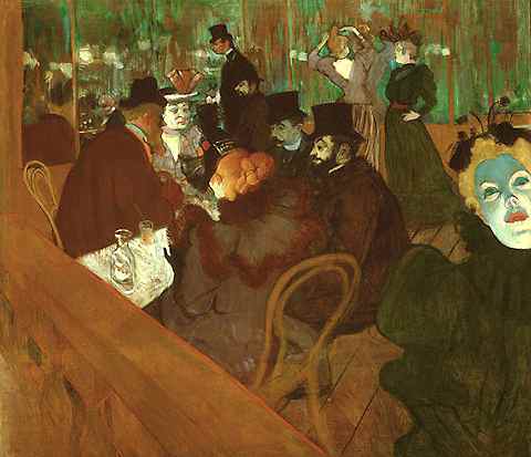
Henri de Toulouse Lautrec,
oil on canvas, 1895
© 1999 The Art Institute of Chicago
This intentionally garish picture represents a group of figures, most of whom were friends of Henri de Toulouse Lautrec, cavorting in the Moulin Rouge, the liveliest nightclub and dance hall in Paris at the time.
Seated, wearing a grotesque fedora and flowing whiskers, is Emile Dujardin, writer and editor of the Revue Independent. To his left is La Macarona, one of the famous Quadrille dancers. Next to her sits the photographer Paul Sescau and Maurice Guibert. In the background of the picture, La Goulue, the most celebrated of the Quadrille dancers, arranges her hair, and above the crowd is the lean figure of Tapie De Celeyran, a physician and Lautrec's cousin and devoted friend. There, as in life, the two are seen side by side, the painter with his melon hat characteristically tilted on his forehead. After researching the life of Lautrec and the famous patrons of the Moulin Rouge, I believe that the redhead at the table is none other than the famous Jane Avril, a favorite muse of Toulouse Lautrec.
The face looming in the foreground belongs to the famous singer May Milton. As you enter the painting, your eye is immediately drawn to May. Her face is one of the many graphic elements of this painting. She draws your eye toward the foreshortened space behind her. I was immediately attracted to her green glowing phosphorus face, as I believe Lautrec intended.
While to the average passerby she may be garish, cartoonish, or ghostly, the green hue is in reality a reflection of the phosphorus fumes caused by limelight -- a stage light in which lime is heated to produce a brilliant illumination -- used at the Moulin Rouge to light the dancers onstage.
Limelight also provided the blurred and eerie colors which are prominent in the background. Limelight was more than simple stage lighting, it was critical in setting the mood of the Moulin Rouge, a cabaret in the loosest terms. Established in 1889, the Moulin Rouge was frequented by poets, artists, writers, and aristocrats, as well as prostitutes, dancers, and the donkeys they rode in on.
Look closely at Lautrec's face, it's almost as though he is wearing a mask. The white glow of this mask does not extend to his ear, leading us to believe that he is almost in hiding. It is as though he is there, but not fully. There is more beneath the mask that he does not expose nor reveal.
Lautrec, who was only 4½ feet tall, frequented the Moulin Rouge as a fallen aristocrat and artist. He was the only surviving child of Compte Alfonse de Toulouse Lautrec. Henri grew up with frail health and twice in his young adulthood broke his leg. Due to a calcium deficiency his bones did not recover and his growth was stunted. He began painting as a young child. With this love of painting, compounded with his physical handicap, Henri devoted his life to his art.
In his aristocratic circle Lautrec felt singularly odd and freakish, but at the Moulin Rouge he was at home. Others were wild, promiscuous, and outrageous -- and Lautrec was no longer the one who stood out. The Moulin Rouge was a haven for him to escape into, and, as the Moulin Rouge gave to him, Lautrec gave back in making the Moulin Rouge a landmark in Parisian history.
It is easy to see why, under the circumstances, how he was allowed not only access, but free reign in detailing the lives of those of the Moulin Rouge. Men and women alike were unthreatened by his stature, allowing him to paint the women in various stages of undress and in other precarious situations.
In order to capture the mood of the Moulin Rouge, Lautrec used colored washes in his paintings, made of diluted paint, applied layer upon layer to create shadows, variations of color, and depth of space. This translucent look, much like watercolor, allows the underlying sketches to show through, giving the painting an unfinished quality about it.
The unfinished quality of the painting caused by the colored washes could also be what one might see through the eyes of absinthe -- a green liquor having a bitter licorice flavor, a high alcohol content, prepared from warmwood and other herbs, and a popular drink in the late 1800s. Later absinthe was found to cause madness by literally eating away at the brain and was made illegal. Lautrec, a known alcoholic, and the many patrons of the Moulin Rouge, drank absinthe. It is also the drink of the carafe in this painting, as shown by the swirling green liquid inside.
As I enter the painting, I am drawn in by the eerie glow that others
deem garish, cartoonish, and ghostly. Had I been alive at the time, the
Moulin Rouge would have been my corner bar, my speakeasy, my home away
from home. While others may see the patrons as lonely, drunk, and
hopeless, I admire them for finding a place of solace and acceptance. The
notoriety and fame that they garnered was a way for the patrons to make
one of their own a star. While many of the most famous dancers were
much sought after during their time at the Moulin Rouge, they often fell
down on their luck after leaving to pursue other avenues, and died
penniless and unknown. Outside their circle, they could not survive.
| I wish to lie in an open field,
for snakes to suck my skin, for worms to stay company with me, and for birds to eat my swollen eyes. |
Benjamin Puah lives in Singapore.
![[exhibition image]](./bin/gravy9-3.jpg)
![[exhibition image]](./bin/gravy9-a.jpg)
![[exhibition image]](./bin/gravy9-7.jpg)
![[exhibition image]](./bin/gravy9-b.jpg)
![[exhibition image]](./bin/gravy9-5.jpg)
![[exhibition image]](./bin/gravy9-9.jpg)
![[exhibition image]](./bin/gravy9-c.jpg)
![[exhibition image]](./bin/gravy9-8.jpg)
If it's an exhibition by Law Office you better think meta-exhibition. Masters of irony Law Office has never failed to produce an exhibition which wasn't about exhibitions, and -- masters of promotion -- never failed to pack them in. The Joe Baldwin Retrospective is the most recent and the most successful in a series of their tongue in cheek productions. Complete with circus-colored posters in Bucktown no less.
After all, a retrospective of five years of unimpressive paintings is just improbable. Your first hints of the put-on is that the crew from Law Office are fitted up in tuxes while the viewers wear Levi's and sweaters, and that valet parking is being provided although most of the "patrons" arrive on bikes and busses. Only the waiters with trays of hors' d'ouevres snaking through the crowd are absent.
But the historical precedence of other Law Office exhibitions should have warned you. The extreme irony and absolute straight-facedness of Law Office is always a delight to observe. The exhibition Beer Tasting II managed to garner four reviews -- at least one of which was presented with the same degree of irony, followed closely by a rebuttal [ed: See Gravy 7 and Gravy 8].
Ah, what a waste of irony. How seriously those artists take themselves.
The Joe Baldwin Retrospective added the accolades of five reviewers to the promotional material, making it look previewed and pre-approved. But with this move Law Office may have exceeded the limits. Although the review by Julia Marsh in FGA number 4 -- "Each related to the next through a thin veil of paint only" -- saw through the facade, others were fooled, for the Joe Baldwin Retrospective managed to get a full-page writeup in the December 1 issue of the Reader -- although... it is hard to tell if this is not a continuation of the chain of ironies.
Fred Camper, in Warping The Power of Icons, blandly states the Joe Baldwin Retrospective to be "the strongest debut show I have seen this year," although he also admits that the paintings "reveal little painterly skill." The remainder of the article is a tapestry of descriptions, speculations, and personal anecdotes and history supplied by Joe Baldwin.
This last thread weaves in and out of the fabric for well over half the article. Rather than dismiss Baldwin, Camper takes him on faith, eulogizing endlessly on Balwin's themes of "humanizing the grid and combining meaning with its denial." Joe is from a family of painters, and grew up with art-speak, and proved fully equal to Camper's questions.
Camper attempts to connect the paintings beyond what Julia Marsh suggested as the connective tissue. But the connections are as tenuous as the need to explain a pun -- "see Joe B" (which should have read as "see Joe be)."
"It is the flag of a nation which spawned our own, and a traditional symbol of power." Ahuh, flags are not symbols, and I would think the tulip to be a vastly more powerful symbol of power. Or loose yourself in the explication of the "Two Rooms" painting.. I won't bother you with details. One more gem: "Caveland may be a critique on consumerism."
And Warping The Power of Icons, may be a critique of Law Office. Great piece, Fred!
Braznin Skrebsnikof, past editor of Gravy, is returning to St.
Petersburg.
A retrospective??
Have they gone legit? An iMac on the table? What's next, valet service outside? If it hadn't been for the PBR, I might have left the show thinking I was in the wrong place. As with most Law Office productions, there is a fair amount of uncertainty in figuring out exactly what you're looking at. Rarely can it be taken at face value. This show, when taken at face value, wasn't very good.
The majority of the canvases were lazy abstractions of the "anyone-could-do-that" persuasion. There was a variety of such abstractions, perhaps where the retrospective curating comes in, but none more interesting than the next.
I would have appreciated some written explanation of what the show was about or what I was looking at. There wasn't any, so face value is the only value.
As it is, the best part of Joe Baldwin's retrospective was
the rainbow posters.
![[Henry Darger Image]](./bin/gravy9-2.jpg)
This title refers to a hand written caption on one of Darger's large assembled pieces. In his piece, it is the "Vivian Girls" who escape with the booty. The scene is chaotic; naked, pre-pubescent girls are running everywhere. They are being chased, as they are in most scenes on view at Carl Hammer, by dangerous grown men in uniform.
Most everyone is familiar with Darger's imagery. He has been posthumously molded into the established "anti-establishment" outsider artist. Very nineties concept. Think Wesley Willis. No training, questionable skill, and totally out in left field. This contrast was starkly evident while viewing the show in Carl Hammers squeaky clean gallery space, which couldn't be further from Darger's world.
I find myself riding the fence when looking at Darger's work. I appreciate people that are a little off (a lot off) center. Dubuffets concept of "Art Brut" (mental patients, freaks, criminals, etc) is an example. But what is it about Darger's work that would spawn a luxurious new book, five figure price tags and a full time museum/study center in New York?
Darger's work largely revolves around the adventures of the "Vivian Girls." There are only seven actual Vivian Girls, but there appear to be hundreds of look-alikes that also take part in the stories. He has carefully chronicled their many adventures both visually and in writing. Scrupulous attention was paid to the details of their lives; the weather, the wars raging in their fictional world.
All of the characters in Darger's drawings are actually tracings, which explains the mysterious lack of substance in most of the faces. Darger would cut pictures from the daily papers, and depending on what he wanted, might enlarge or reduce them to fit into a composition.
This reminds me of Warhol in a way. Both were taking images of mass culture and creating generics. Warhol with celebrities, Darger with little girls. They both sourced their material from the many disposable publications of the day.
What sets Darger apart from other crazies that draw? Is a homeless person who scribbles images on a sidewalk with chalk an undiscovered genius? On what merits? With no art "training," outsider (visual) artists are usually ignorant to the basics of 2-D representation, driving "educated" artist mad. And yet they succeed.
Crazy people have an advantage though. As is displayed by Darger's monstrous eighteen volume autobiography, he was dedicated to his delirium. His body of work is extensive, and his pieces are heavily layered and full of symbolism.
At the time he executed most of what he accomplished, his work didn't have to make sense to anyone. As a result the adventures became exceedingly bizarre. In many cases, the scenes of death and dismemberment become more and more graphic and disturbing. In one panel, the lifeless bodies of young girls are everywhere. Their chests and stomachs have been sliced open, and their guts pulled out.
I found myself laughing as I sat in on a lecture at Carl Hammer. A gentleman who had just finished a book about Darger's life was explaining some of the scenes that he had drawn. How does one explain Darger's work, without hiding behind "artspeak" and theories? He couldn't.
When asked by an attendee of the lecture if he, the author, had read all eighteen of the volumes of Darger's autobiography, the response was a hesitant, "No." He said that he "quickly skimmed" most of it, while altogether ignoring the last handful of volumes. This disappointed me while also illustrating the conundrum of the "outsider" in upper class situations. Their (the insider's) interest is in the surface, the grime, the unsavory aspects of the artist. His mutilated characters and visual attention to pedophilia are degenerate. And yet, it titillates higher class people, currently to tune of 15,000 dollars.
The high brow fascination with low brow perversion is very strange. This explains, however, the very existence of "outsider" art.
I do respect Darger's dedication. Holed up in a tiny apartment, like a hermit, for so many years. His escape was into a world he created himself. With nowhere else to go, or not wanting to go anywhere else, he lived in flat make-believe world full of naked nine year old girls, multi-colored dragons, endless slaughter, and pretty blue skies.
Incidentally, next time you view Henry Darger's work, keep in mind that
at a young age he was sent away to a hospital for the "unwell," for
chronic masturbation in school.
The menagerie at Heavy Petting gets a blue ribbon for best of show without stooping to the sentimentality of big-eyed puppy pictures. The exhibit presents eight artists who provide candid documents of our relationship to the animal world in a variety of media.
Photographer Tema Stauffer give us big slick glossies of dogs, not of the ooh-google aw-shucks baby beagle variety, but a stolid French bulldog and attenuated hyena-like breed, shaved with tufts of hair erupting from its head and ankles. An owner frankly holds her malamute before a hot dog stand. These skilled, not superficial, depictions capture the beasts off-guard in moments of back-stage kennel club tension, and the pictures of them subscribe to a realist tradition that transcends glibness.
Melissa Schubeck contributes work in a variety of media, beginning with photographs infused with an eerie pastel surrealism. The lens menaces a flocked bunny in a manner reminiscent of Cindy Sherman's Film Stills series. It cowers in a tiled bathtub corner, or tucks in for the night with a picture of a kitten jauntily taped to a pillow, a proxy partner that echoes both a pop-idol poster and an inflatable companion in this cutely ironic world of decontextualized stand-ins in spooky domestic settings. Even the lawn ornaments are alienated.
Schubeck also makes her own lawn ornaments, amorphous ceramic sheep devoid of features, and photographs their march on a too green lawn. This photographic work is stronger than the sculptural installation. As I viewed an untitled piece, concentric circles of a pink formica table as a pedestal for a pool of sculpted goo in a large round dish, two giddily ambiguous four-legged creatures swimming and diving in the waves, I couldn't help but wonder what the color photo or digital print of the paddling pets would look like.
Maire Kennedy's sculptural wall pieces contribute the strongest suggestion of something eponymously pettable, but I wouldn't want to touch them. These discomfiting fake fur found objects are simultaneously public and pubic, and look like they were discovered at the pound, or perhaps cultivated in a chia pet manner by spraying old beer on scraps of rec room carpeting. If anything in art longer than it is wide instantly fulfills phallic semiotics, these are the mandatory twats.
Going on to something completely different, painter Patricia Ryan depicts the playful critters that gave me nightmares as a child. A series of small canvasses, displayed vertically, show participants in a parade of dark whimsy: a chipmunk drums, a floppy-eared puppy squeezes a box, a pony fiddles, a bunny strums a guitar, a vaguely Asiatic bear plucks a stringed triangular box, and a kitten with a xylophone follows behind. The bright colors and kiddie illustration content are subverted by the strength and clarity of line.
Jennifer Lapham presents a trio of rabbits painted in cool blue camouflage posed on round mirrors that suggest spotlight pools, crystal puddles, and presentation platters. There is nothing cozy or maudlin about these animals. The icons of soft vulnerability are transformed beyond their stoic concrete mass-produced models to cold masculinized commando lapines about to be launched on the beach.
Like most of this exhibit's participants, the work suggests that the
heaviest petting may be on the heart, and our favored companion animals
can be indifferent, at best, to the possibility of our caresses.
Introduction by the Editor
I was riding my bike through the rain last Friday night, up Michigan Avenue. Being as stoned as I was, I decided to ride on the sidewalk. Somewhere between Hugo Boss and Kenneth Cole, I passed a straggly looking guy who was holding up a white legal pad with the message, WILL WORK FOR FOOD written on it.
An idea flashed in my head. I turned my bike around and with my heart in my throat went up to the guy with the sign. I said, "If you'll work for food, will you work for money?" He said, "Yes." I wanted him to write a review for Gravy.
In such an opinionated field as Art is, it's like pulling teeth to get people to write for the magazine. The reasons for this are varied and ego ridden, and get in the way of getting work done. So I am forever looking for people who will write what they think. This guy looked like he would, plus it looked to me that he had plenty of time on his hands.
When I attempted to explain to him who I was, what I had in mind, and what Gravy was about, it all came out mixed together. So I took a breath, and said, "This is what I want...." I told him that I wanted him to go to the MCA and see the Sol Lewitt show, then write about what he saw. I wrote all the info he needed down on his pad. For this, he got four bucks up front and a promise of a fiver when he gave it to me.
Below is Michael's article. True to form, he was even a few days late with it.
It was good. The color was all I saw and a face in it. It was talking to me, it made me cry and felt good to me. I saw a woman in the picture, it was my mother in it. I saw one more face in the picture. It was a man. The man and woman were going to marry and it was talking to me.
-- Michael lives on the street in
Chicago.
The Walking Dead
This is about the walking dead.
|
Versatility
Don't you think it is time to be more Universal
|
Skotodesk has landed in the GAR Rotunda of the Cultural Center. It is a digital monolith perched in an eerie solitude issuing forth techno-glitch ambience. Markus Popp, a.k.a. Oval, a German ambient techno sensation, has designed a glass-housed play station, a conglomeration of computer display and etched translucent panels which force associations with Kubrick's 1968 predictions of 2001 computer graphics.
The "sculpture" houses a simple audio-based game of click and drag, where all the variables have been limited, streamlined, and made easy. The rules of musical composition, informing the use of 64 provided pre-manipulated audio samples of digital mistakes, are easily divined and implemented.
The Skotodesk, presented here in the gilt vault of the Rotunda, is lit from below by tube lamps buried under the glass-block grids which comprise the floor. The Skotodesk throbs with its own digital music, and the empty room resonates with it. The visual and aural effects are beautiful and dramatic to say the least, but the concept behind them is not as strikingly revolutionary as Popp supposes.
Intending to circumvent traditional corporate modes of music distribution, Popp allows �viewers� to create their own ambient tunes using his own software, titled Oval process. He wants to stymie the usual flow of music/art consumption (genius presenting product to the viewing/listening masses) by promoting populist access to the means of production, allowing those with fingers and ears to click their way into their own ambient bliss.
Popp's plexiglass-encased G4, in the end, does not issue a Marxist challenge, but is ultimately just an advertisement for a product. It's an attractively designed teaser. Really, to effectively utilize Popp's innovation, with an unlimited scope of compositional possibilities, you have to BUY his software for your own system at home.
Now, if there was a CD burner, through which you could preserve your own quick on-site musical adventure, and take away a free souvenir of your encounter with art, then we'd be talking cool and coherent artistic intention. As it is, it is just plain cool.
Skotodesk is on exhibit through ..
"How many galleries in this town?" I ask David Prinsen, proprietor of Dynamite Gallery Project, an exhibition space in a quiet part of Grand Rapids, Michigan. But then, all parts of town are quiet.
He counts on his fingers, "One, two ... thirteen. But some of those are frame shops." The actual number is something like seven or eight. Quite a number for the largest town located the furthest north into the state of Michigan.
And of these seven, Dynamite Gallery Project stands out in its innovative exhibitions. Working with cohorts Stafford Trapp and Brian DeYoung, the three collaborate and take turns curating small exhibitions in the Gallery.
They have just initiated their second season with an exhibition titled Devices. consisting of five mechanical items by Val Valgardson, Gregory Green, and Jno Cook. The show runs through October 21.
Valgardson is showing his plant clipping machine, encased in a rounded glass and hardwood frame reminiscent of the type of demonstration installation seen at the Museum of Science and Industry, except there is no lengthy expository placard. Besides the blades which repeatedly brush past the plant at fixed intervals, the display features additional environmental support which provide light, a water feed, and a drain. The light and water are of course controlled by timers, as is the repeating edge trimming of the captive plant -- the image is of a cared for but caged bonsai tree.
Gregory Green is represented with a pipe-bomb book and a selection of computer viruses. The pipe bomb (three pipes) is enclosed in a dictionary opened to the page defining "anarchy" -- with only the tripping mechanism missing from the contraption, and, one would hope, the black powder. An exploding book has always been one of my fantasies, in total contradiction to the benign passive expectations we have about books. Knowledge can be dangerous. As you approach the display stand, you hope no one will bump the stand, or at least hope that the battery has run down.
The computer viruses are represented as floppy diskettes, with hexadecimal printouts of their coded content. Again, there is the scary possibility that your nearby laptop, although in the trunk of your car, might become infected. Green has produced pirate radio broadcasting stations elsewhere, and you wonder if his evil genius might reach beyond the floppies on the wall.
Jno Cook is represented with his obnoxious gravity monitor, which sounds a car alarm if -- as might happen -- gravity fails. The device is a tripod with a weighing scale at the top, from which hangs a bowling ball. Cook arrived with the device late, hours into the opening, and assembled it on the spot. After a demonstration, the viewers just had to test it repeatedly.
In a separate room is Cook's model of the solar system, although somewhat out of scale, with all of time condensed to about three minutes. In those three minutes the sun, a 1000 watt lamp, slowly dims, and the earth, a wildly spinning classroom globe mounted at the end of a revolving arm, also slowly winds down and eventually halts.
The resounding metaphor throughout the exhibition is us and our condition, both individually as in the image of the dying sun, but also as kept specimens in a zoo called earth, like Val's plant, protected yet in constant danger from books, from viruses, and from the eventual demise of all of physics.
Machine art some years ago mostly involved equipment which just hummed and buzzed and moved like a machine, rather than as a machine. There have been great displays of machine-like surface functions, including the visual aspects. But metal and rust and bolts and noise don't make a machine, and artistic reflection on these aspects fails to penetrate the interior.
What David Prinsen has done is to bring together three artists who are committed to penetrating to the soul of a machine, and the first principle of a machine is that does something useful. All the devices in this exhibition do something or can do something, they are not mock-ups, they don't comment on fasteners and movement, they fully intend to serve a function.
This type of machinery work casts far beyond the surface level of machines, although it is hardly as easily penetrated as traditional sculpture. Of course it is about the material. It is also about the elegant solution to the problem of function. It resounds of an arcana of gearhead practices. And it reflects on broader issues. The measure of success for these objects could be measured in their closure, that is, how close a device comes to achieving its apparent goal. But these devices are, finally, also about representation.
The fabrication of machines and mechanisms is such non-traditional art that there are enormous gaps yet to be filled, most of which revolve around the almost complete lack of understanding of viewers and collectors. Consider, for example, the conservation needs for this equipment, which now involve fuses and greases and caring for solid state circuits. Will museums hire garage mechanics or require a degree in mechanical engineering for a preparator?
A much larger gap involves the general lack of how things work among viewers. Machinery can involve such intricate specifics, that much of the elegance of a solution is frequently lost to all except other gearheads. To see a couple of device-making artists inspecting each other's mechanisms is to glimpse into a subculture. "Do you use type 555 timers?" I hear Valgardson ask Cook. "Ahuh." What are these people talking about?
David Prinsen explains, "Devices is an exhibition about the maintenance of our condition."
Then he continues, now reflecting on Grand Rapids, "The condition of the art scene in Grand Rapids is poor. Most of the local work is uninformed, underdeveloped ego drivel. The art buying community is sparse and conservative. The local non-profits are run by dinosaurs. Most of the private galleries are frame shops. And the best artists in Grand Rapids are not represented by anyone in Grand Rapids. We need help." Prinsen sees his Dynamite Gallery Project as a direct response.
The next show at Dynamite Gallery Project opens Saturday, October 8. The title is "Faith," and will include Conrad Bakker who makes Feshlii and Weiss style fauxobjects for installations bent towards Kiekegaardian philosophies, Guy Chase who does paint by number kits all in one color, Elsa Heemstra who does needle point based on visions from God, and Jeffrey Vallance who finds clowns in the Shroud of Turin, and the Sasquach in the eyes of the famous crying Virgin of Guadeloupe.
-- Jan van de Zon is a native of Holland,
MI
Ten artists fit easily into this opening show of Chicago's newest space. I almost felt a twinge of the new Chelsea inside of Arena. Big, white industrial space. Instead of an old cab garage, Arena was a meat processing/packing plant before its present occupants. Thankfully, they did a good job disinfecting the place.
Speaking of meat processing, Patrick McGee based his site specific installation on the previous use of the exact room he is in. His string installation knowledge was employed to model after the "Carbon 60" molecule that was a result in the smoking of the meat.
McGee's piece is wonderful. It shows a dynamic understanding of orienting his perspective, and ours, to the molecular shape of the carbon. The perspective here cuts and quarters the molecule, massively enlarges it, and gives the view of being on eye level with it. There are two doorways leading into the room of the installation, allowing many different yet optically challenging views. McGee's selective use of orange paint to define the molecule is perfect.
Also exhibiting are: Jody Ake, Monica Balc, Donna Dennis, Tatiana Garmendia, Alisa Henriquez, Janet Indick, and Elena Lin.
Included in the show are the director of Arena, Oklahoma Ward, and his mom, Shirley. Many of you may have been familiar with Oklahoma's space in Wicker Park that closed a while back. It is good to see him in the thick of it again.
If you want to reach out and touch them link to [www.arenagallery.com]
Presented behind Vedanta's Washington Blvd space.
Finally a space is doing something outside their cube(s).
This event was true to its name; videos shown in a...parking lot. Not "movie" videos, but "art" videos. Sometimes a blurry line for artists. Work from eight artists were included, John Hogan's being the most enjoyable for me. In the interest of not upsetting anyone, I'll refrain from any criticism of the videos themselves, and just highlight the event. Viewing video work once or even twice just isn't enough to really get an idea of what the artist is talking about.
It was a great time. Rather than seats to sit on, someone provided pink foam insulation boards to park you butt on. If there is a future to the idea, we'll see who's smart and brings some lawn furniture next time. The evening temperature was just right to relax in (without a thermostat!). There was a chain link security fence surrounding the parking lot that could have been used in the event of a WWF style cage match breaking out. Maybe a multi-media performance for the future?
Most importantly, everyone there was there for the art, which was a nice change from the booze crowd.
Vedanta also recently hosted "Flicker" on their front sidewalk. I did not see this, but the release sounded very cool. Somewhat along the same lines, "Flicker" using the front sidewalk, these two happenings are a welcome experiment for me. I just wish they had started with them at the beginning of the summer, rather than the end.
You never know though, can you project onto snow??
Curated by Deborah Johnson and Kristen Van Deventer
With love from Vedanta and Bodybuilder and Sportsman
![[check mark]](./bin/xcheck.gif) Duncan Anderson at 11th Street Gallery
Duncan Anderson at 11th Street Gallery
I really liked the figurines, didn't look at most of the titles cause I had the wrong glasses on (and the one time i did it said, "untitled") -- but even without titles they all struck a chord, they seemed so apropos for the type of thing one slightly images, but never see implemented, or never get to do. They seemed like fairy tales brought to life -- and a lot of fairy tales are pretty gruesome in their details. The blue birds picking out the eyes of the girl doll, the elephant looking at himself in a mirror.
I cared less for the flat work, because somehow it seems as compressed
with meaning as everyone else which does that sort of stuff.. easily gets
overloaded, and the suspicion of fabrication comes to the surface all too
rapidly. -- Anon
Crush at NFA
The Multiples Show
Like every one of sixty artists with two friends and their moms showed up at the Multiples show at NFA. I could not get in the door, and to see the multiple stuff was impossible. But there were sixty artists and their multiple stuff, probably sixty times ten, that is, let's see, 600 things. That is all I can report, and part of this is speculation, I admit.
I went to Body Builder and Sportsman on the floor below. At least Body Builder's new space is not laid out like a gopher's tunnel. In fact, the space is occupied with two caged shower stalls and a countertop caged receptionist girl -- rather than the usual Body Builder bar consisting of a plank on two boxes, manned by two dudes with candy dishes and beer. The candy dish remains.
Tromp, tromp, tromp, meanwhile - the ceilings at Body Builder creaked
with the footfalls of the sixty artists and their moms at NFA above. Body
and NFA are in one of those buildings where you wonder which way you will
have to run when the smoke starts coming out of the walls and ceilings.
The moms probably got nervous too. -- MBA
Melinda Fries at Joymore
A delightful collection of annotated zip-lock bags covered one wall. Each holding small objects or collections of materials, each with a caption handwritten on the wall. Captivating and sympathetic, these descriptions -- usually involving the event or a person rather than a description of the actual content -- remained nearly totally unselfconscious. Cumulatively they started to describe the artist.
Another wall was mounted with a grid of color snapshots in three groups, two groups of sort of "curious things in the neighborhood" and a group of decapitated people -- all imaged at about hip level.
These snapshots read completely different from the zip-lock bags of personal objects. For one, I don't know the reason for the collection of people's hips and butts. The neighborhood shots divided up into vertical and horizontal shots. The portrait format shots had a much larger visual impact, as could be expected. Why is the camera at times is held horizontally and at times vertically?
Overall I don't mind the presentation of data in this form, as long as I can get a thread on a line of aesthetic logic to follow, but I lost it on these. And mounting snapshots at ankle level asks for some data points to be ignored.
And there was a video, and there were a bunch of kids rolling around on
the floor. The door at Joymore opens inward. --AS
Gary Dobry at Judy Saslow
Dobry's big and bare-stretcher canvases currently being shown at Judy
Saslow are a must see! Dobry uses Boxing metaphorically. The artist's
statement talked about "fights" each of us are in, some just "fighting" to
get out of bed in the morning. Dobry is a great craftsman as well, but his
artistry never allows his technical skills to steal the show! --
Anon
John Frazer at Roy Boyd
An interesting comparison just struck me -- the intense similarity of Roy Boyd's artists and that of Joel Leib's Ten In One. Where Boyd has the market of interesting yet boring artwork, Ten In One is boring yet interesting.
John Frazer is very Boyd. His canvasses are unpainted, yet called "paintings," and refer to decorative pieces more than intellectual stimulation.
That isn't always bad. In this show, Frazer uses only two elements to
create his pieces. Blank, natural canvases and cut down wooden rulers.
He is looking at geometry and balance, creating squares and more squares.
I would consider this work more pleasant design than art. -- Adam
Mikos
"Tales from the Art Crypt" a book by Richard Feigen
quick review
"A Bourgeois Vacation"
I love this book. Feigen gives it to everyone; "the painters, the museums, the curators, the collectors, the auctions, the art." That could considered a headhunting list to who gets ripped in the book. He also has a special place for all "social climbers" in the book. I really enjoyed reading the book then walking through the Art Institute and seeing the names of many of the people he exposes as rats, chiseled into the marble above their honorary wings.
Go figure, but it's fun to read about the how's and why's of who these people were. Most interestingly, he presents a life on both sides of the largest debate in art. Are you in it for the heart or are you in it for the funds? I enjoyed making up my mind on an answer, then changing it, and changing it again. He has been through it all and carried a spirit for the chase from start to finish. It is bourgeois and exists entirely in a privileged society, but if you read it as fiction it is very enjoyable. -- Adam Mikos
"Tales from the Art Crypt" a book by Richard Feigen
I hated this book. Feigen starts off with the heavies, and never lets up: There are rich people out there, and there are dealers, and all of them compete for ownership for some certain artworks -- paintings, in fact -- for reasons which are absolutely incomprehensible to me.
Yet I enjoyed reading the book, it is a view on a whole culture
completely outside the realm of my existence, and, I suspect, outside of
the ken of most people. And furthermore, who cares? As Mikos suggests..
read it as "fiction" -- it might as well be. -- Allegra Secunda
Pilsen Arts Walk
Lots of art and lots of open doors. The art was hit and miss, but the
enthusiasm was infectious. This was billed as the "30th Annual Pilsen Arts
Walk" which to my mind sounds a little inflated. One thing is for sure,
there is more happening in Pilsen than appears to the eye. -- Adam
Mikos
Recent (re)installations at the AIC
Yinka Shonibare, Diary of a Victorian Dandy
Why did they put this crap back up? He must be related to, or dating someone that has some juice. Otherwise this is just a poor decision. Each of these looks like a still from a bad rap video. One of them in particular is so crucially out of focus that I get annoyed even remembering it. And how much did these cost to print?
Bigger is in no way better. Shonibare is intending
to make fun of a bourgeois culture and point out that there were no
Africans in that society at the time. Instead he makes a life-size fool
of himself with his personal dreams of excess, which are in no way
obscured by his attempt to veil them behind a farce on a "racist" society
of the past. They were idiots then, he's an idiot now.
-- Adam Mikos
At the Stables in Humboldt Park
"..of intrinsic nature," a group show (43 artists) put together by the Park District.
One is always rewarded for going to see something new. No exception
here. This show was heavily Latino, with a few token whites, women, and an
Asian or two. It must have been interesting to feel affirmative action from
the other side. But, it's a Puerto Rican neighborhood so what do you
expect? The work, although not totally inspiring to me, was well executed
and professional from start to finish. Lots of color and a crafty feel. I
enjoyed the handmade quality that the majority of the work had, bringing up
a craft vs art debate almost immediately. Their new building is
fantastic with a beautiful courtyard, and the opening couldn't have been on
a better night. The strawberry tamales were good too.-- Adam Mikos
ARC in a new location
The new location of ARC, around the corner from where they were
is a truly wonderful space. The Opening September show looked good too,
especially Terri Foster's room full of tea and coffee stained tea
and coffee objects, from filters through beans. The board of teabags
actually evoked some history, and to see the array of beans in bondage (as
well as the resewn squashed cherries) was a delight.
Art boys Grenko and Mason
at ARC
Ron Grenko
at ARC's opening show left something to be desired.. perhaps the bleeding
edge. "A slight texture restrained by transparent couch covers," Alan
Bolle was overheard to comment. In the same room Nathan Mason
mounted candies and cutouts from magazines. Ahuh. -- BS
Ann Wilson lecture at MCA
Fiber will be fiber will be fiber. If it's not about feminism, it's about the body, family history, or quiet suffering. Oddly, many fiber artists do exactly the same tasks that they rail against women having to do in the past. Wouldn't welding or ditch digging be a more direct opposition to sewing and cooking?
Ann Wilson gave a wonderful lecture,
eloquently explaining her work and motivations. Her "sewn holes" are
delicate and nearly beautiful; they appear painful and erotic at almost
the same time. However, I would like to see more experimentation on her
part.-- Adam Mikos
Heavy petting at Joymore
This space cracks me up. No outward indication of what is going on
inside. Heavy petting is an ok show; it seems to have a common
theme that they stick to (animals, pets, etc), and the work was viewable.
Although all the flat work did the edge bleed, photos and paintings alike.
I like the bleed, but (as memory serves) when everything looks the same it
looks cliché. Two photos were of particular interest, showing
scenes from dog shows. Reminds me of when that dog puppet from the Conan
O'Brien show went to a dog show and humped all the dogs. Very, very,
funny, and yet very, very, sick.-- Adam Mikos
Work at Gallery 312
Don't miss Mick O'Shea's depiction of the art / industrial
complex with an installation of trains, structures, houses of cards
for the artists, big name bill-boards, and a lot more, called "artworld."
At [Gallery 312] till
October 21. -- BS
Eric Dimas at Standard
Is it the artist or the materials themselves that makes these
interesting? These "paintings" are in no way "painted" by the artists
hand. However, his results can be fascinating. Did anyone else see
fetuses?-- Adam Mikos
Marc Schwartzenberg at Suitable
"Sorry to those people who came to the opening on Saturday!! The
Reader mistakenly printed the correct date, but incorrect day of
the week. It was FRIDAY, Sept 22. Not Saturday. Sorry..." And it
rained cats and dogs, too. -- DF, [http://suitable.org]
Misreading Modernisms
Postscript: After two weeks of silence Fred Camper returns to the Reader on November 17th with a critical article on .. art, but not a single word about modernism. I forget what the article was about.
-- OSL
![]()
![[gravy logo]](./bin/yspoon.gif)