(10 June 2000) This is an annotated listing of links to galleries, museums, art organizations, and artists collectives in the Chicago area, which deal with the visual arts, including photography. Sites of individual artists are not listed. This file is 88 KBytes, and includes 150 images, totaling about 950 KBytes.


 The Cows
We managed to get through all of 1999 without mentioning "Cows On Parade," the big public display of decorated plastic cows. The raffle at the end, which netted $3,500,000 in sales, spoke to its success. And there are books ... and of course there is a website ... somewhere. But go see Suitable Gallery's [Squirrels On Parade].
 Explosion
There has been an explosion of URLs this last year. We have 72 new gallery sites to look at. Bear with us.. it sometimes takes time to make sense of things.
 On Speed

We are now checking these pages out with a 586 and a 56K modem. So the bias for speed has shifted upwards. Now on when we say slow we really mean **SLOW**. But we do have standards. A recent Tribune article on Web Page Design mentions 30 seconds as a fast website, and a minute as a long wait. Our intolerably long wait is 4 seconds.

And now that everybody is using Kompozer (or some other crutch) because they think HTML is "code", there will be lots more fancified pages than incompetent ones. But see some added observations below.
 Frames are out, Tables are in
You can date a website by the compositional crutches in use. Last year's Frames are on the decline, but Tables are all the rage. Especially (since everyone copies from everyone else) the commercial three-column page with absolute widths. This may result in more goofyness (like cutting off text) than the sheer aggrevation caused by Frames.
One thing Tables does is to reduce the chances of getting decently indexed by a robot, since Microsoft's Komposer dispense with all the Header tags when it uses a table constructions. It is Microsoft's inventive method of keeping all those amateur web sites from getting any notice.

The really bad news this year at first was JavaScript. Currently better than half the home-made web sites below use the cute mouseover tricks. Java is like chrome on cars, it just adds glitter -- and bulk, by doubling the number of gif files which have to be fetched.
![[FLASH]](./bin/zflash.gif) Holy shit, what is this crap?
Holy shit, what is this crap? It's Flash -- and you better get used to the delays and funky graphics, and the need to get more plug-in's. It's the new fly in the ointment -- the people who used to delay the 10:00 PM television news broadcasts with endless and senseless graphics are now on the web. It's also the biggest pain in the ass if you don't wanna get stoned before browsing.
 Why can't I read this stuff?
Because of Cascading Style Sheets is why. OK for corporate internal use, but on the public internet it just makes all too many pages unreadable because of bad mis-guesses about viewers' browsers and screens. Get the Opera browser; it's cheap, much faster and smaller than the Big Two browsers, and allows turning off the CSSs, and a lot of other stuff, by switching to your own preferences with a single key.

If you must use one of the Big Two browsers, at least set them up to ignore a few things, like the bizarre font sizes and colors which are forced on you, endless nervous gif files, and especially the black backgrounds and hyperactive wallpaper.
 Sucks
Sucks For your benefit, here are the ten signs of Newbee websites, which may be used to rate website, and will explain at a glance why you are loosing your patience, or why you get headaches looking at that stuff. The list goes from "Really Sucks" to "Sort of Sucks." We compiled this in January, otherwise Flash would have headed the list.
| The Really Sucks Hit List
|
|---|
 The site opens with a 600 meg
interlaced Gif. The site opens with a 600 meg
interlaced Gif.
|
 Pages made with kraft paper and
crayons. Pages made with kraft paper and
crayons.
|
 All the texts are images. All the texts are images.
|
 You have to search for links. You have to search for links.
|
 Menus look like Grayhound schedules. Menus look like Grayhound schedules.
|
 Interlaced GIFs produce headaches. Interlaced GIFs produce headaches.
|
 Absolute tables cut off the text. Absolute tables cut off the text.
|
 Gigabyte image files fill tiny
rectangles. Gigabyte image files fill tiny
rectangles.
|
 Unreadable thumbnail images. Unreadable thumbnail images.
|
 The page gets bookmarked under
"Welcome." The page gets bookmarked under
"Welcome." |
Take note, especially if you busy writing another college text titled Modern Web Page Design, that the main aggravations are: time, navigation, and readability. Readers are, first of all, impatient.
Art resources on the web are scarce, quickly outdated, often dull, and frequently badly constructed. Before you start idling away your time browsing the local scene, check this list. If boring, empty, full of broken code, or not downward compatible, we'll let you know.
If there are comments, they reflect an impatient check with a fully equipped Explorer or Netscape version, sometimes both. A later look with a text browser (Lynx or Bobcat) will check text-mode compatibility.
|
|
If the opening pages are barfable, the content won't be addressed. Otherwise the notes on content stand to be corrected, especially if things change. To do so, just send your angry comments via [eMail]. Feel free to suggest new sites for addition to this list. The site can be anywhere (like in California or Finland), but the content or artists need to be in or around Chicago. |
There are 100 mainstream galleries in Chicago and another hundred miscellaneous, new, temporary, and NFP galleries. A large number of then have by this time (AD 2000) acquired URLs. But don't expect a lot; expect a lot of misdirections, moving gifs, images which won't fit your screen, black backgrounds, and enough Java crap to make you want to cry.
We gave up on colleges and schools in 1998. College web sites just plain suck, and are mostly a joke. They tend to be extremely fragmented, with aliases and alternate machines to be found everywhere. Work by artists either doesn't exist, or goes stagnant.
We have had complaints from some viewers that the icons are confusing, although no-one complains that they are irritating. Assuming that most Chicagoans are now using Pentium-mooga-mooga boxes, and have their 56K modems or ISDN lines installed, we are reintroducing the truly irritating icons again.
This will give your Mooga-mooga CPU some cycles to consume. If this truly bothers you, turn off "moving images" (Explorer: uncheck Play Animations under View, Internet options, Advanced; Netscape: find it under the View menu).
Also be warned that the Intuitive Icons seem to change meaning with time, have not been uniformly applied, and in many cases we never got to them. So don't be instantly insulted.


 The ultimate purpose was to formulate indices for access,
speed, and navigation, but we ain't there yet. Quantitative
measures will develop when all this becomes a science.
The ultimate purpose was to formulate indices for access,
speed, and navigation, but we ain't there yet. Quantitative
measures will develop when all this becomes a science.
![[NEW]](./bin/zbang.gif)
| New - means hasn't been looked at yet. |
![[ON LINE]](./bin/zclick.gif)
| Online - means exists only on the Web. |
|
| Fast - means well constructed and fast. |
| Wow - means well worth looking at. |
|
| Info - means there is information. |
| Pix - means there are images. |
![[FUN]](./bin/xlava.gif)
| Fun - means entertaining. |
![[KRAFT PAPER]](./bin/xblack.gif)
| Black - means Kraftpaper and Crayon Design. |
![[TABLES]](./bin/xtables.gif)
| Tables - means tables with set widths. |
![[FRAMES]](./bin/xframes.gif)
| Frames - means frames for no real purpose. |
|
| Bad Ideas - means too many Bad Ideas. |
![[BAD PIX]](./bin/zlace.gif)
| Bad pix - means interlaced images. |
|
| Slow - means it takes an eternity. |
![[AHUH]](./bin/zahuh.gif)
| Ahuh - means we can't figure this site out. |
|
| Yuk - means aggravating or just stupid. |
| Bomb - means will jam your browser. |
![[OOPS]](./bin/zoops.gif)
| Oops - means skids on a Text browser. |
![[MAC]](./bin/zmac.gif)
| Mac - means it was built on a MAC. |
|
| Img Text - means too much text as Gif files. |
![[CLICK THRU]](./bin/xtrike.gif)
| Click Thru - means intermediate thumbnails. |
![[BRAIN DEAD]](./bin/zdead.gif)
| Brain dead - means poor navigation. |
![[DEAD]](./bin/xskull.gif)
| Dead - means the site is inactive. |
![[TRASH]](./bin/xtrash.gif)
| Trash - means don't bother. |
| Flash - means endless and senseless graphics. |
List
[Aaron]
[ARC]
[AB]
[Artists Net]
[Art Discovery]
[Anchor]
[Art Institute]
[Artnet]
[Art 2000 Chicago]
[Art^n]
[Athenaeum]
[Armstrong]
[Artemisia]
[Arts Council]
[Academy of Sciences]
[Chicago ASMP]
[Henry Adams]
[Aldo Castillo] --B--
[Beacon Street]
[Block]
[Byron Roche]
[Big Shoulders]
[Broadcast Comm]
[Mary Bell]
[Belloc Lowndes]
[Bartlow]
[Book and Paper] --C--
[Caca Journal]
[Chicago Artists Coalition]
[Chgo Art Dealers]
[Centerstage]
[CPR]
[Dep of Cultural Affairs]
[Cultural Center] --DEF--
[Dead Tech]
[Evanston Art Cnt]
[Edelman]
[Experimental Sound]
[Friedl]
[FOTA]
[Fassbender] --GHI--
[Gray]
[Gravy Mag]
[Gallery Guide]
[Gall 37]
[Gwenda Jay]
[Gallery 312]
[Hammer]
[Hart]
[Rhona Hoffman]
[Historical Society]
[Idao]
[Intuit]
[Ill State Museum] --JKL--
[Koppel]
[Kass/Meridian]
[Klein]
[La Llorona]
[R H Love]
[Lill Street]
[Leonardis]
[LyonsWier Packer] --MNO--
[MCP]
[McCormick]
[MoCA]
[Mexican Fine Arts]
[Nicole]
[N'Namdi]
[NEA]
[New Art Examiner]
[New Art Now sales]
[Ottinger]
[Oriental]
[Orca Aart] --PQRS--
[C.P.A.G.]
[Portia]
[Palette and Chisel]
[Big Pigeon]
[Renaissance]
[Reader Listing]
[Saslow]
[Sherman]
[Smart]
[SOFA]
[Spencer Weisz]
[Schneider]
[Suitable] --TUV--
[TBA Space]
[Temporary Services]
[Terra]
[Tobai]
[Uncomfortable Spaces]
[Ukranian]
[Vietnam Vets]
[Vedanta] --WXYZ--
[Woman Made]
[Donald Young]
[Zaks]
[Zolla Lieberman]
Bad URL, could not connect, or not up yet:
[Lydon]
[Havana]
[Inside Art]
[Perimeter]
[Primative]
[NIU Chicago]
[Brauer]
Nice. A large on-line inventory of clear bright images on a white
backgrounds -- paintings and prints.
Gratuitous frames. An unreadable site map.
Some information. Otherwise, no images. About 8 months out of date. Bookmarks under "Untitled Document."
Prints and photographs, opening on a yellow background. Slow, but there
is stuff to see, although you will have to click through a number of pages
and be frustrated at coming to a dead end all too frequently.
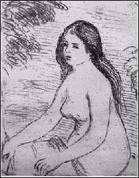
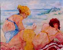
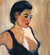
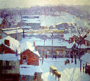
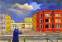
Renoir at left, Daniel Anderson at right.
Interesting.. design competitions, which got awarded to a German Coffee Machine maker and somebody who makes metal snails or armadilloes. The web site ain't up for an award.
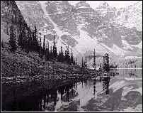
And architecture, but all the photographs were taken at night, we think.
This website uses tables, JavaScript, GIF animations, and forms. It is best viewed in a browser that supports these features.
... they warn.
CAC services, and artists' images, lots of them.
And a listing of openings..
And white backgrounds.
Gone to FRAMES, which will drive you nuts, and lots of mouseovers. You can go nuts here. We still have no idea what goes on here, except that you better have JavaScript running, and expect other windows to pop up.
These people make something image wise. We are not sure what. Luckely, they have a FAQ page, which has it all spelled out..
In inventing and patenting the first 3-D digital output technology, the (art)^n group has been able to push the conceptual and aesthetic boundaries of its own unique medium: the PHSCologram. This medium presents digital content (i.e. computer generated models, digital images, video, and photographs) as back lit film stills that are 3-D and viewed without glasses. The medium is arresting in its unconventionality.
Ahah!
A four column listing of things. Tiny type, but still won't fit a 640x480 screen.
Links to auctions, galleries, artists.
Oh my God.. The opening mouse-over (they couldn't help themselves) clickable gif files are down to 37K, from 700K a year ago, and the chalk line is gone. Now the Art Institute looks like a conglomerate of sky scrapers. Smoke still wafts from the Sears Tower (one of the outlying buildings of the AIC Complex). Yes, we are never satisfied.
But link directly to the museum with this URL, [http://www.artic.edu/aic], and avoid the temptation to check out the school. Here you encounter a cute 286 KB moving gif whose purpose eludes us.
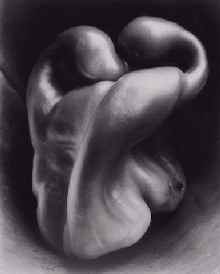
But then check out
exhibitions or
collections. We tried
photography,
Edward Weston, and were rewarded with a pepper, which box we couldn't
get off the screen no matter what we did. Bad Idea (TM).
A printmaking collective, with red on white text. Frames. Tables with set widths, so some artists names (on the "Benefit" list") get folded.
More info than images.
"Bringing the wonders of the art world to all those who love art."
Sets up a web page for you, bio and five images, cheap. Some 40 artists have taken advantage of the offer (which can't be beat, BTW).
OK, check it out. The pic by
[Gail Shapiro].

That is the Chicago Chapter of the Midwest (Chapter) of the American Society of Media Photographers, with links to images of some 35 Chicago or Midwest photographers, all with their own web sites. So expect many of the same glitches -- the usual precautions apply.
Lots of corporate and commercial work. Many black index pages. The
picture is from
Jay Rubinic Photography
(http://www.rubinic.com).
[AB
Gallery]
FRAMES. A little confusing, but here goes: Some pages of visual art, with dark single images for each of a number of artists (some dating from 1968!), some links which don't connect.
The index frame is unreadable, dark blue on black, and will start individual instances of your browser. Strange. DTD for HTML 3.2, even though that standard did not include frames.
Some links don't connect, and the overall feel (looking at copyrights and creation dates) is that this site has been standing still for a few years.
There is a ASMP (read "photography") set of [pages] also (1996)... sponsored by Lab 1. The first link leads to a message about getting those Netscape 2 extensions (That's right, the illegitimate HTML 3+ set). Zzzzzzzz.
But some nice photographs, and although some are way too dark, and there
is way too much text (we know, we should talk).
This year on a newbee black background with hot local links... Oh well.
Three months behind as of February 2000, with upcoming shows "TBA" and
news "Under Construction." You can look at the
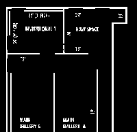
[floorplan], however. Or
some images of member wares in the archives for last year.
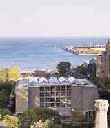
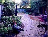
Another boxes within boxes construction, looking more like Alta Vista than a museum website. The set-width box this site comes in drives us nuts on a 1024 screen. In case you have always wondered, here is the Peggy Notebaert Nature Museum. The secondary pages are much more readable, and generally carry a clickable path line.
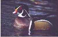
Can't find many images, although there is generally one per page. Check
out the
[peregrine] page, and
biological collection. (that's a duck at the left, not a peregrine)

Fast, Info, links to participating Chicago Galleries.
We have
more links that they have links.
A gallery with a mission, to wit, a focus on Latin America.
Built on " BBEdit 5 and Dreamweaver and SimpleText and Photoshop and GraphicConverter and MSIE and Communicator and my PowerMac 6400/180 and a whole lot of thought." Funny. Explorer breaks the opening paragraph of the current show for some reason.
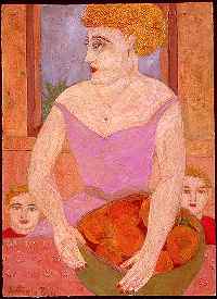
Naugahide background, which is not too objectionable. Two dozen artists
represented, most with a single image, and bios. Antonio Bou at left.
A large archive of one image per artist, from tiny thumbnails.
Unreadably dark indexes; other pages in lighter colors. Gratuitous
frames.
White text on black in tiny type. A few small images.
Check out the [edible books] link.
The rest is mostly corporate information, and blind links.
http://www.bartlowgallery.com
A half dozen painters, with a half dozen images each.
[Site Of Big Shoulders]
Frames you cannot get out of. Art and texts, four artists. But also poetry, fiction, performance, music, bizarre (and cute) index page, strange backgrounds. But active and busy..
Not exactly white walls style.
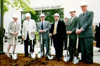
The Mary and Leigh Block Museum of Art website is best viewed on a monitor displaying thousands of colors. It uses Geneva or Arial fonts for text (which need to be installed on the viewers [sic] computer). Futura is used for display graphics and headers (and doesn't need to be installed).This website uses frames and colored tables, making it look best in Netscape Navigator 3.0 or higher. Microsoft Internet Explorer 3.0 and higher also displays the site properly.
This website was created on a Power Macintosh using Adobe PhotoShop, Macromedia Freehand, BareBones Software's BBEdit, GoLive Cyberstudio and Equilibrium's DeBabelizer.
Get serious. (And they say PC users are gearheads!)

Not much there. Frames which don't work or seem useless.
A link to Lil Orphan Annie. We preferred Playboy's version.
Designer Black and gif text, but lots of images. So many, in fact that it takes forever to load the "exhibition page".
Sixteen artists represented on-line with "click to see" stuff.
Tables with some strange screen placements. Link colors voided,
unavoidably.

The on-line version of the occasional Caca Journal, organ of the Chicago Art Critics Association.
Fast, easy to read, and unadorned (typeface is their medium).
Representing Vedanta Gallery (below), a dance company, a theater, something called Art Discovery (below), and Anchor Graphics (below).
Consider this a coverpage for some local enterprise.
We have given up on last year's "Department of Cultural Affairs" as a link, for it is virtually impossible to find anything. But this year things are better organized, you can find things. You probably want to look at the [Visual Arts] page, still a link with annoying mixed case file names. There ain't no pictures on view -- maybe we missed them. And "Current Exhibitions" points to the Chicago Sun-Times ("go read the newspaper") and (as before) to ../tourism/CulturalCenter (see below).
Public Art still has no contact, although it has a single
[web]
page.
Current Events are listed by month --oops, for February somebody screwed up on TABLES on the "Tracings" page; the page is like 1240 wide. Well, do some side scrolling.
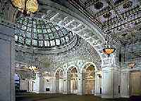
The postcard collection, BTW, is [here]. We tried about ten times to send one. Never worked. Next try the ["Hypermedia Tour"], much flashing graphics and a few nice pix of the insides of the building.
Can't find those construction pics this year.
[Centerstage]
An attempt at the obverse of the objectives of this site: When you get completely fed up with the rants you have been reading here, check out this "centerstage" location, where you will be gently guided along.
No images. Unreadable index frame; but the actual pages are clear and easy to read. Just don't do a search for Beret International or Body Builder and Sportsman galleries.
Try their base URL for some other interesting things. They are trying to
cover
everything.
A really annoying background, but there are images of some dozen
artists.
White text on orange; all the text is in fact presented as interlaced gifs, even the artists' bios which are so small as to be unreadable.
Turn off the background color and images, and watch the whole web site
disappear.
Art and technology.. things exploding, sound, robots, who knows what else.
A really hard to read and navigate site .. but might be interesting if we
could figure out what is going on. Looks under construction.
Mostly texts, and a few images of current exhibitions.
Designer Black or white on Kelly Green. Some links are dead (because of typos). Links to other international sound sites.
That eyeball on the left is a speaker, they say.

That's Tom Blackman's Art Expo in case you don't know.
Finally dropped the burnt umber and black backgrounds, and tent awnings, funky graphics, and slide shows.
Currently (May 2000) it is a clean set of files, easy to navigate. All in anticipation of the year 2000 Expo. They will no doubt spend the rest of the year mucking it up with catalog exerpts.
 Haven't looked at TBA space, but it is
[here]
Haven't looked at TBA space, but it is
[here]
Frames. Photography. Best viewed at 800 x 600, 24 bit-color, even if most images are B/W.
A lot of work represented, although most of the images are way too dark.
The "click to see enlargement" will drive you nuts.
![[ASLEEP]](./bin/xsleep.gif)
(6/00) Seems to be asleep. The opening 270,000 Byte black and white
logo is all you get. Here reduced to 1400 Bytes, and transparent.
Artists and some images. Very slow; the full images are compressed into thumbnails, so expect waits on all the pages. Black backgrounds with a dull green border. A huge table construction, and boxes within boxes. Doesn't fit well on a large screen. Phew. Hot local links.
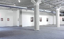
Nice pic of the gallery. though.
(6/00) Coming soon. One page. Maybe that is the way of the future. Who needs all
that other stuff.

Reviews of the art scene in Chicago, mainly.
Vigorously written,
opinionated, but informed.
Presented as a number of covers (Gallery Guide Covers) on a map-and-a half of the USA. At intervals you will have to tell them what type of internet connection you have. Pick the wrong type and they will send all the rest in PDF (bad Idea) format -- which will take forever.. and of course you will need to aquire a PDF reader, read the documentation, set the preferences, and learn new mousing tricks.
The absolute frame sizes cut off texts or dislocate them. Strange stuff. And no matter what we clicked on some of the menus, nothing ever came up. Loser.
That isn't true. Some things did show up, with another browser, but could not be read.
The on-line Gallery Guide seems to have found a technological solution to
a problem which will show up at any moment. For now it is brain dead.
An index in Kraft paper and crayon. We were almost at an end, till we finally noticed the Cyan on Dark Blue "continue, hook, hook."
The remaining pages at some point go to white backgrounds, but the fonts are forced to Gigantic sizes and expect a 1280 x 1024 screen.
Past exhibits are in the process of being archived. There are some
images, but some are giant file sizes, and a few are broken. You'll be hard
pressed to find these, cause navigation is extremely difficult.
Difficult to navigate and difficult to find anything of interest.
Most pages look like file cards from a Betty Crocker Cookbook.
Nice clean, big images, presented on Designer Black and obnoxious backgrounds. Some three dozen artists with single images, some with more. Artist information is sparse.
A number of broken links, missing images, and strange link colors
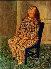
Left, Susan Kraut.
Designer Black, and Frames, but a dozen artist each represented with a handfull images. Mostly German painters
Easy to access from the Frame index.
Faster than in the past, although the images and text-gifs still keep the site at a trudgingly pace.
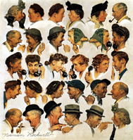
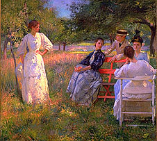
But still loaded with great stuff. And, uh.. Norman Rockwell. Go see;
there's a lot of stuff besides Norman's stuff.
One image per artist, about a dozen presented, out of a list of 30.
Designer black, with overly large images (read "slow"). Can't be helped
for Darger, though.
Wow, a sensible index page, where everything can be found.
But the artists' page scrolls 3000 pixels wide, and some pages have
umongous font sizes for no apparent reason except to make them unreadable.
Couldn't find this site even after perusing endless State of Illinois web pages for an hour. Nobody really gives a shit about museums. Alta Vista found it in a second. For events and exhibitions see this [link]. No changes. No images. And a year behind.
Link also to the "Illinois Artisans Shop"
[next door], also
owned by the State, and also a year behind -- or mislabled.

Ok, we had the Agency as aic instead of iac all year. There are no changes, except that they switched Kompozers, and are using Win95 Mozillas, thus changed from html to htm suffixes. More confusion.
Fast, but only mildly interesting. Actually, as deadly boring as last
year, except there is
more boring stuff. The newsletter
[on-line] is still in pdf (Bad Idea) format. Sucks. Find their
[deadlines]
here.
Found under either "outsider.art.org" or just plain "art.org", Kraft paper index file with unreadable dark blue on black. The rest of the pages are on white, but entirely composed of links to the outside.
And one link back to their own home page, which doesn't connect. There are some other HTML glitches, which our forgiving browser just ignores.
One image, for the current show.
Ah, a single index page which seeems to give you all the information you want -- untill you discover that the top bar belongs to [Artnet.com] and leads everywhere except to Koppel.
Koppel's artists link from the index page, but dont click on anything arbtrarily, you might end up at Artnet.com and get totally lost. F for navigation.
We think it is furniture and photographs.
Gone is the circus of stuff which used to occupy the index page.
The remaining pages present themselves as black rectangles bordered with index material. The set-width of the black boxes is bothersome, for the viewable area occupies only a third of the screen. On some pages the white texts flows onto the surrounding white border, making it unreadable.
But, as with last year, there are more images than at some museum sites.
Images are bright but dark. The image files are small, yet the pages take
forever to scroll to the screen. Definitely beyond our 4 second limit.
Includes also discussions by Paul Klein, and related links and material.
A black index file, and black "home" file which looks like wartime Lucky Strikes. Oh well. The menu images trashes consitantly on some browsers. Mouseovers. None of the text/image file are protected against transparency, so they mostly disappear if background color is turned off.
Dozens of well known artists, with a few images each, located yet another click away. Left: Ed Baynard.
Plenty of images and information, accessed from a single index to the artists.
Glossy wallpaper, interlaced images, and unhelpfull link colors.
![[]](./bin/c-leon.jpg)
Speeded up since two years ago, and up to date, that is, the current exhibition is actually current.
Gone to slick white text on black backgrounds, and "transmitted live from the gallery." How do they do that?
Thumbnail images of gallery artists. This pic by Howard Finster.
Last year: Fast, Cute, and some really nice graphics.
Arg.. they hired a professional also. The pages are on muddy pastel
backgrounds, and presented as tables which limit things to about 3/4 of our
screen, with some texts presented as graphics. Losage this year.
Well, a little less lovable than last year. Tiny type, and a list of
artist, all of who connect to www.artnet.com with one image each, for which
you will have to click through a number of links -- same as last year.
Not easy to navigate, and very slow, but there are images by a dozen artists, out of a set of 30 some. And other stuff. Find the link to a [selection] of artists, rather than following the "Gallery Artists" link.
"Click here" navigation, but the images are bright although very slow to load, since this site loads 50K files into thumbnails, and 100K into small images. Designed by the [Pigeon] lady.
Check out [about Aron].
Left: Jared Joslin.

(6/00) After an interminable 30 second wait you get... nothing, except a request to download FLASH, with the single purpose of putting you through a boring sequence of logo graphics, like the 10 oclock news on channel 9.
Then a default to white on red apologies and a listing of the current exhibitions. Skip the graphics and just go directly to this [page], but we guarantee nothing, and the link will prolly change next week.
This site uses frames and javascript. Your browser doesn't seem to support frames. Do you have them turned off? If so, please turn them on to view this site. That option is under "Preferences" or "Options". If you are using an old browser that does not support frames, please update. You can get Netscape 4+ or Internet Explorer 4+ or 5 for free. You will be glad you did - the newer features are great and you miss so much (on most sites) without them.
So, more changes again this year. Very slow to load up its index file, and more Gizmo requests. But this year the phone number is on the index page, and the pages have white backgrounds. But go to the [site map], it will be a lot faster (and easier) to navigate.
Past exhibits are archived.. well, sort of. Essays and a few images. But
now on a readable white background.
Was a fast site last year, but has slowed down some even though we now own a 56K modem and a Pentium box. Slowed to a crawl, in other words.
Switched from slime green background to retro black. And the images got larger and darker. Switched to Frames also, with absolute row dimensions, so that neither window fits on our 1024 window. One thus has to slide the sliders back and forth to see anything. Fine for mouse people, too much work for us.
We think they hired a professional.
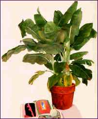
Nice clean pages, with tiny thumbnails pointing to the work of over a dozen gallery artists.
Left, banana plant by Gary Bukovnik.

A lot of texts and installation shots, cased in a gaudy background. Text
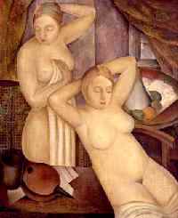
as images, hot links, anoying gifs, and more.
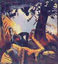
Rose Portillo at left, Carlos Cortez at right.
(6/00) It works (it's up) but most of the images are blanks, although
clickable as thumbnails. Still gets you nowhwere.
We checked a few, and most are missing.
Maybe things are not up and running yet.
Extensive background on a dozen artists though.
Black background and two giant opening images slow things down a bit. And then there is sound. Senseless table constructions.. A "virtual gallery" attached, but no active links. A "historical gallery" attached which appears to be 6000 pixels wide.
18 of the gallery artists are represented with a bio and one image each
-- sometimes with no image at all.
Actualy starts off with an image of an issue as the index page; we would guess the current one. It has taken a while to come around to not holding back for fear of losing advertising revenues or whatever.
An archive of past issues, about two years' worth, but you have to clip through giant Jpegs, some of which bleed to the background -- but that is because the background image has a bad SRC. A number of the links point to a MAC Harddrive, rather than a web directory.
A lot of the texts are full of MAC punctuation code. We dont know why, cause the source code advertizes as iso-8859-1. Otherwise the pages are clean and flow nicely.
They still don't list the [Utrecht] catalog among their links. Oh well.

Yes, the outfit in Washington DC.
This year's comments: (1) They are still there (you never know). (2) Money has moved to the index page.
Nice white backgrounds, better organized, too. WE have no idea what that
kid on the index page is doing.
[New Art Now]
On-line sales in Designer Black pages, but what the hell, there are lots
of pix -- a nice selection of contemporary stuff.
At left Michael Thompson, at right Larry Stark.

Mostly western art; two dozen artists represented with an image or two and writeup each. Giant blocks of nbsp's generally misplace all the titles. But you will figure it out.
At left is Don Crowley -- sort of untypical of most of the work.
Fast, easy to browse, images, well organized.
Things seem to be working finally. Opened it with Netscape 4.7 with all the gizmos up and runnning, expecting the worst. A blue (everything links) on mauve (D8BFD8) index page. But we still won't put up the FREE APPLE QUICKTIME VR PLAYER SOFTWARE. But we are game, so we downloaded the first panoramic movie we ran into. It took the 803 Kb file 8 minutes at ... (let's check the log file) ... 45,333 bps.
Oh well... we think they are stuck with hi-tech garbage.
But look at the map collection, or the photographic collection. We looked at all of Tom van Eynde's 81 images. That took an hour, for besides having to go through the intermediate thumbnails, the files are 100K interlaced gif files. They look like shit while they fetch and scroll (which will take an interminable 20 to 30 seconds each). And they are way too dark. But, all the complaints aside, they are absolutely wonderful.
Here is our 13K jpeg version of the original 112K gif file. It would take under 30 seconds to convert all of the gifs. We know, we tried it, and it would save viewers hours of download time.
The Oriental has this thing about explication, from listing what software and stuff you must have, to complete directions on how to save and print images, down to the details of what buttons to press in your browser and (of course) in Photo Shop. This extends to a gearhead description of their hardware, a SPARK running Solaris, etc, etc. It seems like a security risk to list the OS down to the version number. And we are not impressed; we are typing this file with Edlin on a Cray.
For all the hardware, there are still problems with navigation. But the
site is interesting and large.
Chicago Public Art Group's web site, forever under development.
Info and some colorful images, but hardly enough.
On a baby-blue background, but fast.
The artists' images are cgi'd from Artresources.com and difficult to
navigate since the same list keeps appearing without any indication of what
links have been visited. Some 30 artists represented.
[big pigeon]
A site by Cindy Loehr. Super. A rotating series of literary and visual exhibitions. OK, the IMG sizes need serious rescoping, things would get a lot faster.
But it is a delight to see a well managed web site dedicated to art and
art issues entirely constructed of donated visual art. This is the sort of
use the web has been waiting for. Congrats Cindy!

Newbee black background, Java, FRAMES, still with absolute widths, etc. Same complaints as last year. We didn't have the patience to pursue further into the site.
Netscape 3?
Using the Artnet form and format.
So, tiny type, slow, and thumbnails only.
"View in Netscape Navigator 3.0," it said last year, so this year you get an unwelcome Java box telling you to switch to "Netscape 4-something" -- we can't read the rest cause it doesn't fit the box. That is why we don't run JavaScript. Except for the obnoxious Java Crap (TM) the site looks respectable, even with that tacky tack-board background.
Represents a number of artists with images and bios, reasonably fast
thumbnails, and then, bright, clear images. Cool
[The Reader Gallery Listing]
So, three years ago we wrote a Perl script to check the ten files at Yahoo every hour on Thursdays and Fridays to see if they had been updated, and if so, the script would get the files, extract the openings and receptions, shorten the text to 40 words, retain the trailing phone number, sort them alphabetically, and write a single web page locally. That took 87 seconds, kinda long for a dual Pentium box and a T-1 line.
Now the Reader finally has them up in a single file on their own
website, first thing on Fridays, and the openings and receptions are
checkmarked ( ) like
this. Certainly easier to find things. So, for a while we stopped scamming
the Reader Listings. (We had the publisher's permission to gleam the
openings, BTW.)
) like
this. Certainly easier to find things. So, for a while we stopped scamming
the Reader Listings. (We had the publisher's permission to gleam the
openings, BTW.)
(September 2000)But because of many complaints, in August we rewrote the Perl script to again sort through the file to list the openings. (now at [another] location.) It now takes 14 seconds.
Museums, BTW, may be found at...
(6/00) Still sort of under construction we suspect, cause not much is up yet. A
pleasant site, though.
Current and past exhibits at the Suitable garage.
See especially the
[squirrel] project. The
images unfortunately open in targeted windows, but they are great fun.
A few artists on line with one or two images each. Obnoxious menus, like a pull-down form to select artists from. At least there are no thumbnails.
Most images are fast loading, some are way to big.
Oh, much faster -- and we get it: it's posters. There is a background
black bar which blots out the text (like their phone number) in some window
sizes, but oh well..

We lost it this year on this site.. besides going to designer black, and opening with an endless series of moving gif files, we have no idea what is going on. There is no rational information on the index page. And not much anywhere else.
And FRAMES.
Anyway, it doesn't happen till November. They still fill one inch square
areas with 10K images.

Gone to hell since last year. Text as gif files, Java stuff, black background. Frames. All too many Press Releases. And the rest under construction.
Check back much later.
Frames, but makes sense here. Text as images; interlaced images.
Photography; mostly international comtemporary images.
All on black with limited width tables -- making the text almost unreadable -- but a sampling of bright clear images, but only a few.
Has more of the looks of a brochure than a catalogue. images.
Nice clean pages, although the fade-into-white texts on the index page almost disappear altogether. DT tags without tables. Sparse is in. But speed is out, some of the images are 300,000 Bytes. Strange links, probably meant to be cute but confusing to readers, along with the use of link colors for highlighting. Oh well. Lots of info though.
Klehm's images open in a targeted window and take forever to arrive. The
texts overwite each other.
A little faster than last year, and there are images, printmakers and
painters. The thumbnails are truly tiny, and so are the images, all
interlaced gif files. They dropped the frames for TABLES and image maps, but
on white backgrounds.
Wildly improved over last year, that is, it is faster and smooth. Is that word applicable? Well, last year we called it clunky because of the "slideshow" which hobbled about like a crippled horse.
Much smoother this year. Nice images. And much faster. But they might as
well have just substituted the larger ("click image for larger view") images
for the mini-slide show.
Without a doubt the most interesting local art site, representing Beret International (the last of the Uncomfortable Spaces galleries in Chicago), and includes also Law Office, Margin, Body Builder, Suitable, Temporary Services, and Next Space. Lynx compatible. No Bad Ideas (TM) used.
And at the end of May 2000, Beret is closing.
The current show's Press Release in tiny type.
Otherwise, images of 13 artists on line.
"Best viewed in 600x800" -- maybe turn your monitor sideways.

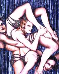
Wow. Some opening, thanks to Java.
But there ain't nothing there. And the repeated curtains get a little
tiresome.
A great archive of two dozen past show (on, ahum, designer black), and
current offerings.
If you are not running "Flash" then skip the opening page, cause nothing whatsoever will happen -- you will just get a blank page. Of course all of Donald Young's patrons run Flash 4 and Netscape 5++ on Pentium II processsors. So go to [http://donaldyoung.com/dyg_home. html] instead, and bypass the blank opening file.
Some 20 artists have images, but these are also introduced with more cute Flash stuff. Figure that 90 percent of browsers will not be able to see this site. Explorer will stop at each artist's page and ask if you want to upload Flash bla bla. Just say, "no" and wait. Eventually you will get somewhere. Or note the file name and delete the "1" from the base name.
We didn't have the patience to wade through the rest of this.
Starts with a script error on one browser; didn't check with any others. About 25 artists represented with a few clean clear images each.
No Frames, no page length tables, no click-throughs, and fast. Only
bother is the endless geo-cities boxes which pop up. Some external links are
broken.
All in black with Cooper as the default font. The targets to new screens is just obnoxious.
A few artists' images. And a number of glitches with image files.
Add Your Comments